Use Images in Email Smartly
Many email marketers prefer HTML emails to plain text messages because HTML emails support images. Images make the email more attractive, easier to read and understand and, in some cases, facilitate email sender recognition. Keeping that in mind, some email senders tend to "fertilize" their emails with as many images as they can. But it's important to remember that the images can both serve the better recipient's response and completely ruin it.
In order not to fail with your email marketing campaign because of the image abundance, below you'll find a couple of tips on how to use images in your emails in the smart manner.
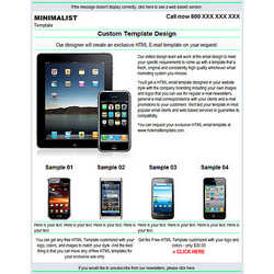
Before you start designing your newsletter think what the purpose of the image in your email is. If you want to use the images to demonstrate new products, collections, books or whatever your company offers and you expect to add many images to the message, in this case you should stick with a simple email design avoiding any background images or any big logos in the message in order not to overload the email much.

If you are going to send only text in the email, you can think about adding graphic elements to make the message more attractive.

But again, don't overdo in order not to switch the recipient's attention from the important information in the text to the beautiful images which do not have much sense. For example, you can add a nice logo at the top, a border around the text, and your photo next to the signature at the bottom to give a look of professionalism to your newsletter. Use 1-2 pictures that add to the text, spice it up but do not push it to the background.
Be careful with using a big logo image at the top of your newsletter. The recipients whose email clients do not load images automatically won't see it and may miss the whole email. Also, avoid using weighty images. If the image loads slowly, the recipient may not want to wait intil it is loaded and close the message.
Don't forget about the alt text for the images. This is a great place for writing a description for the image. It will help the recipients who block the images from automatic download decide whether the image is worth loading or not. And use some of your keywords in the alt text for SEO purposes if you keep the archive of your newsletters on your website.
If you ask about the best way to insert the images into the email, I would recommend that you upload the images to your website and link to them from the email. This way you achieve the lesser message size and faster email delivery.
Here you can read how to upload images to the website.
The final step of the email newsletter design is testing. If you put much time and efforts into creating a beautiful email newsletter, you'll be disappointed if only a part of your audience see your work, won't you? So, take time to test your email design in every email client, web mail account, and mobile device that you have access to.
Designing and testing of a good email newsletter requires HTML knowledge, patience, and time. It may take hours or even days for you to create and test a nice looking HTML email with images. If you don't have enough practice in HTML or don't have much time to devote to the email design, our highly skilled team is at your service. We will design an exclusive HTML email template on your request. You will get a professionally made email design tested in the majority of email clients and ready for the use for your regular email newsletters and occasional messages to your subscribers.
Click the link below to request an exclusive HTML email template from us.
http://hotemailtemplates.com/


