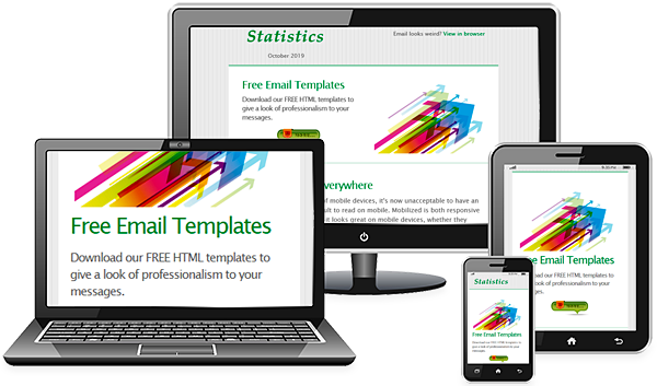
Use Responsive Email Templates for Mobile-Friendly Campaigns
Mobile and tablet Internet usage is skyrocketing. Every day a large quantity of users surf the Internet on handy mobile devices rather than on desktop or laptop computers. And more and more people are pulling out their phones to check their email.

Mobile Internet users are a large market that cannot be ignored anymore. Mobile and tablet email opens hit 50% this year, illustrating the need for email marketers to adapt email campaigns for mobile devices. So, designing for mobile has become as important for your emails as it is for your website.
Below are a few tips for mobile-friendly layouts and design elements:
– Use single-column layouts with the width 500-600 pixels. They are easier to read, and if they break, they do so with less harm.
– Use touch-friendly links and buttons. Make sure links and buttons have a minimum target area of 44 × 44 pixels. There is nothing more unusable than a ton of tiny links on a touchscreen device.
– Pay attention to the font size. The minimum font size displayed on iPhones is 13 pixels. Keep this in mind when styling text, because a smaller font will be upscaled and could break your layout.
– More than ever, make your message short and to the point, and, if possible, place all important design elements in the upper part of the email. Scrolling to read a long copy is much harder on a touchscreen than with a mouse.
– When possible, use display: none; to hide extraneous details in your mobile copy. Elements like social buttons are good for a desktop Inbox, but are not always easy to use on a mobile phone.
Today when it’s more important than ever to optimize email campaigns for mobile users, we make it easy to create newsletters that your subscribers can read on any device. To ensure your campaigns look good on any device including mobile phones and tablets, we have recently made our HTML email templates responsive which adapt themselves to whatever device is being used to view them.


